| ||||||||||||||||
Hornet's Creations. Welcome to my "Creations"
page, which hosts all of my finished Garjen-related projects. Currently, I have several abstract wallpapers for you to download, along with a Windows Media Player Skin. I'll put some of my 3D works online when I've brushed them up a bit; they still need some improvement. Please note that these are all covered by Garjen's copyright and the notice you agreed to when you entered the site. Infraction.
In a nutshell, this is how Seren should have turned out. I was getting a bit annoyed that most of the detail in my wallpapers goes unnoticed, and so this is part of a gigantic wallpaper I made just for this purpose. The original document is over five thousand pixels wide, but Infraction just shows a small part of the detail. (In case I've foncused you ( Seren.
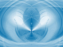
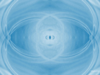
This is a product of one of my stranger experiments, the details of which are still classified. I started Seren for the same reasons as Infraction - to try and show some of the detail. I went about it the wrong way, however, and therefore Seren (and thus Dipity) didn't come out how I expected. See Dipity below for more information. Dipity.
The twin of Seren, this was a result of the same experiment. Whilst in the early stages of making the original wallpaper, I couldn't decide how best to apply one of the filters. So I duplicated the image, applied the filter one way to Seren, and then the other way to the duplicated copy. I then finished Seren, and then applied exactly the same steps to the duplicate, which I later called Dipity. They were created in precisely the same way except for that one step, and as you can see it really made a huge difference to the finished article. As I mentioned with Seren, I didn't end up with quite the result I had hoped for. The Power Of Blue.
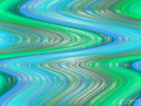
This was the result of being lent a graphics tablet. And yes I did mean to say graphics. The colours are a bit too intense for my liking, but it looks washed out if I try to fade them - so you're stuck with it. Vorpal.
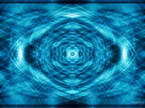
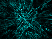
The result of one of my experiments, I can't decide whether I like it or not! Still, you'll be the judge I suppose. The two black lines are a mystery - I've no idea where they came from, but they seem to suit it. Insomnia.
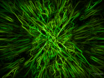
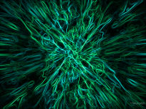
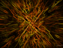
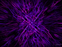
Everyone seems to like this one. It's based upon 'Electric Abstraction', which can be found slightly further down the page. I'm still bemused at the intricacies... I only seem to have creative moments at half past two in the morning, and I have yet to work out why. Hence the name. People keep asking for different variations in colour, so I've provided the most commonly requested shades below. I have to say that the copper and gold version is my favourite... If you want another colour, drop a note in the ShoutBox - that's what it's there for. Please note that I won't alter the balance, so you couldn't have one level green and the other red - the offset is part of the art, never mind that it would destroy the blending.
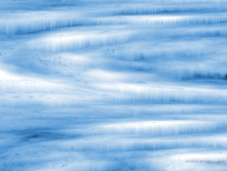
Return Of The Tundra.
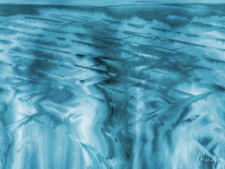
And no the first tundra isn't up for download - it was awful. This is a great improvement on the first, but it still isn't as good as I'd have liked. I'll probably redo it at some point. The Thaw.
In contrast to Return Of The Tundra, this actually turned out better than I expected. Storm Harvest.
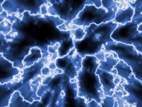
Don't ask me what I was thinking of when I made this - it's supposed to be someone looking at an electrical storm from underwater. Firstly, I completely forgot to add the distorting effect of the water, secondly, the clouds are too faint, thirdly, I forgot to unhide the moon layers, and fourthly, why the heck is someone underwater in an electrical storm?! I'll revisit it at some point to finish it off - I feel that this has potential. Electric Abstraction.
It's been pretty much ignored since the release of Insomnia, but I still like it. The Road to Roam.
For the hippies among you. This was a result of an experiment with the shear filter and the noise gradient, along with my usual assortment of filters. I must admit that I don't like this that much, but since some people do I've left it here for a while. Unless I see the downloads increase, I'll remove it. Skins. I have just the one skin at current, although I'm working on another one - and it'll have changeable colours. This is my first skin, but it does the job. It is fairly unique among WMP skins as it has two modes - normal and micro. Micromode allows it to sit at the top of your screen in the middle of the titlebar, which is usually dead space. I believe it will work with Windows Media Player seven or later, but as I have been unable to test it on that version I can't be sure. The latest one is version nine (which you can download from Microsoft), so if you have that it will work perfectly. I was unable to upload the skin due to an unexpected development (some of the more important skin data files seem to have vanished, and I can't find them in my backups either). It will soon be online, fear not. | ||||||||||||||||||||||||||||||||||||||||||||||||||||||||||||||||||||||||||||||||||||||||||||||||||||||||